In this project we had to create a one minute animation using photography (720 photographs = 1 min). We had to work in certain themes. My theme was around the stereotype of how Muslims are perceived as stupid. I've also worked with the issue of how Muslim women are always perceived as oppressed and forced to wear hijab (head scarf) and that it's stopping them from building a future etc.
Song: Sami Yusuf - Free
Hope you enjoy the animation :)
Wednesday, 7 September 2011
10% Miniland Project
This is our community project of the year, where the whole college gives back to the community. The Miniland 10% project was aimed to help revamp the SANTARAMA Miniland. We were the biggest group and so we were seperated into different groups. One group was working on buliding a new building which was soccer city. 5 groups were working on revamping and rebulding existing models. 2 groups were for graphics and information.
I was in the graphics group and I had to create a new map for the miniland
This is what it looked like before
 And here's my final map
our aim was to make it more eye-catching and child friendly

I was in the graphics group and I had to create a new map for the miniland
This is what it looked like before

our aim was to make it more eye-catching and child friendly

A-Z Typography Project
In this project we had to create our own type using different objects and and patterns. We had to do all the letters, all the numbers, and the punctuation marks of our choice.
Here's my final type


Here's my final type

and here are some of the other ones


Copy Cat - Editroial Project
In this project we had to create a double page spread for a magazine on the French film "The 400 Blows". We had to use our essay that we have done for Critical Studies earlier in the year.


Monday, 23 May 2011
Photo Farm - Photography Project
In this project we had to take photography to a new, different, and creative level. We had to followe tutorials and here are the best photographs:


X-Ray tutorial - we had to scan in flat objects and transform them into X-RAYS

Food tutorial - We had to cut fruits into thin slices and put them on a lightbox so that all the little details show then thak photographs of it.

Water tutorial - We had to take shots of water drops. You need lots of patience for this.

Polarization tutorial - This efferct is done by putting plastic infront of a computer screen and 3D glasses infront of the camera lense and you get this cool effect.

Rule of 3rds tutorial - We had to take photographs from different and interesting perspective.

Elements tutorial - Everyone chose different subjects to photograph for this tutorial and I chose to do flower photography but doing it differently by keeping the flower in coloured water, the flower then seeps up the colour and it's changes and become like the colour of the water.

Torch tutorial - We had to take photographs of light. To get this effect you need a slow shutter speed and a dark room and a torch.
Triptych
iDesigner - Packaging Project
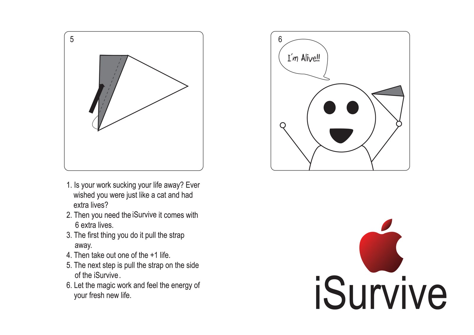
In this project we had to design a packaing by recreate the Apple brand using design emergencies that most designers go through. My design emerengency was iSurvive. It's for all the designers that worked very hard and lost their health in the process. iSurvive gives you all the health and energy you need.


The 6 packagings

Side view of packagings

Top view of packagings inside the box

Side view of packing
The following pictures is the story of how to use the packaging:

Kusudama
Kusudama is a Japenese paper art, similar to origami where they create beautiful designs with just paper. We had to create one and this is it:


front view

Top view

3/4 view

Monday, 28 March 2011
Character Identity & Symbolic Evolution
Project 2: We had to do a branding project for a movie and 3 characters in the movie. We had to do 4 logos and 4 business cards. The movie I've chosen is "The Notebook" and the characters; Noah, Allie, and Anne Hamilton (Allie's mom).


This is the movie's logo
This is Allie's logo
This is Noah's logo
This is Anne Hamilton's logo

Tissue box/business cards
Tuesday, 22 March 2011
Just My Type - Typography book project
This was the first project of my second year of Graphic Design. We had to do a typography/quotes book consisting of 10 double page spreads. The 1st page is for my quote and the rest is for 9 classmates. My concept was Type Scene (like Crime scene) where I had the quote as the victim and the weapon of murder is the typography.


This is the 1st double page spread (Me)

This is the 2nd double page spread (Stephanie)

This is the 3rd double page spread (Kaylee)

This is the 4th double page spread (Kate)

This is the 5th double page spread (Denieme)

This is the 6th double page spread (Kishalya)

This is the 7th double page spread (CJ)

This is the 8th double page spread (Guy)

This is the 9th double page spread (Paulo)

This is the 10th and final double page spread (Jared)

This is the front and back cover of the book,
Where the type (BEAT) is the front.
Subscribe to:
Posts (Atom)